

Personal Website Redesign! (2025)
I’ve had this redesign on my To-Do List for a while and finally found the time to make it happen this summer.
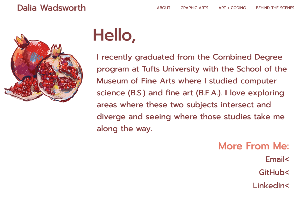
Built during my third year of college, the previous version of this site was written in vanilla HTML/CSS and JavaScript and was definitely due for an upgrade. That’s not to say there weren’t parts of it I still enjoy, I just knew I could definitely improve upon them.
The Problem(s)
There were a few things I knew I needed to change:
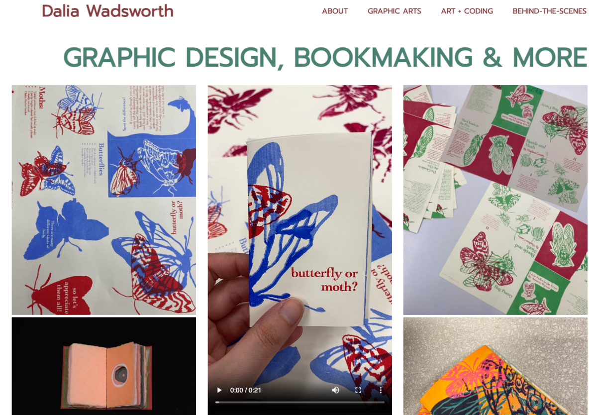
- On the page, “Projects,” displaying my graphic design and other visual artwork, you couldn’t interact with the images to understand what the work was about, how it was made, when I made it, etc. Not very helpful for understanding my process.
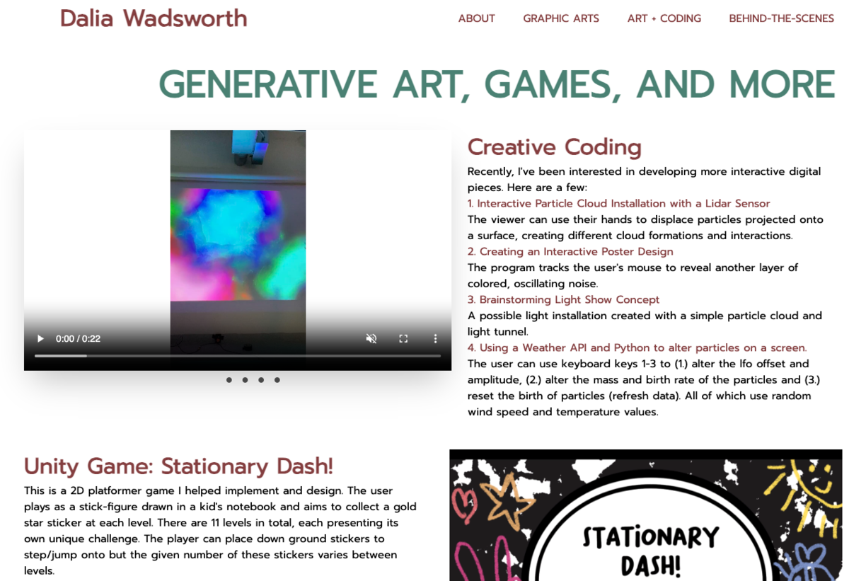
- The “Coding” page … I don’t even want to talk about it. It got the job done (barely) but there was too much text, everything looked crowded and trying to view the projects in a slideshow was a hassle. Here too, I wasn’t giving enough explanation for the work or my process.
- The overall design was bugging me. I wanted something more spacious with a lighter color palette and more visual elements and interactivity to engage the viewer. During my design process, I also came to the realization that the theme just felt like it didn’t fit my personal style anymore, I craved something more vibrant and playful while still aiming to maintain a level of sophistication.
- As someone who’s been interested in blog content, I wanted to start one of my own and I knew it would be easier to do starting fresh.
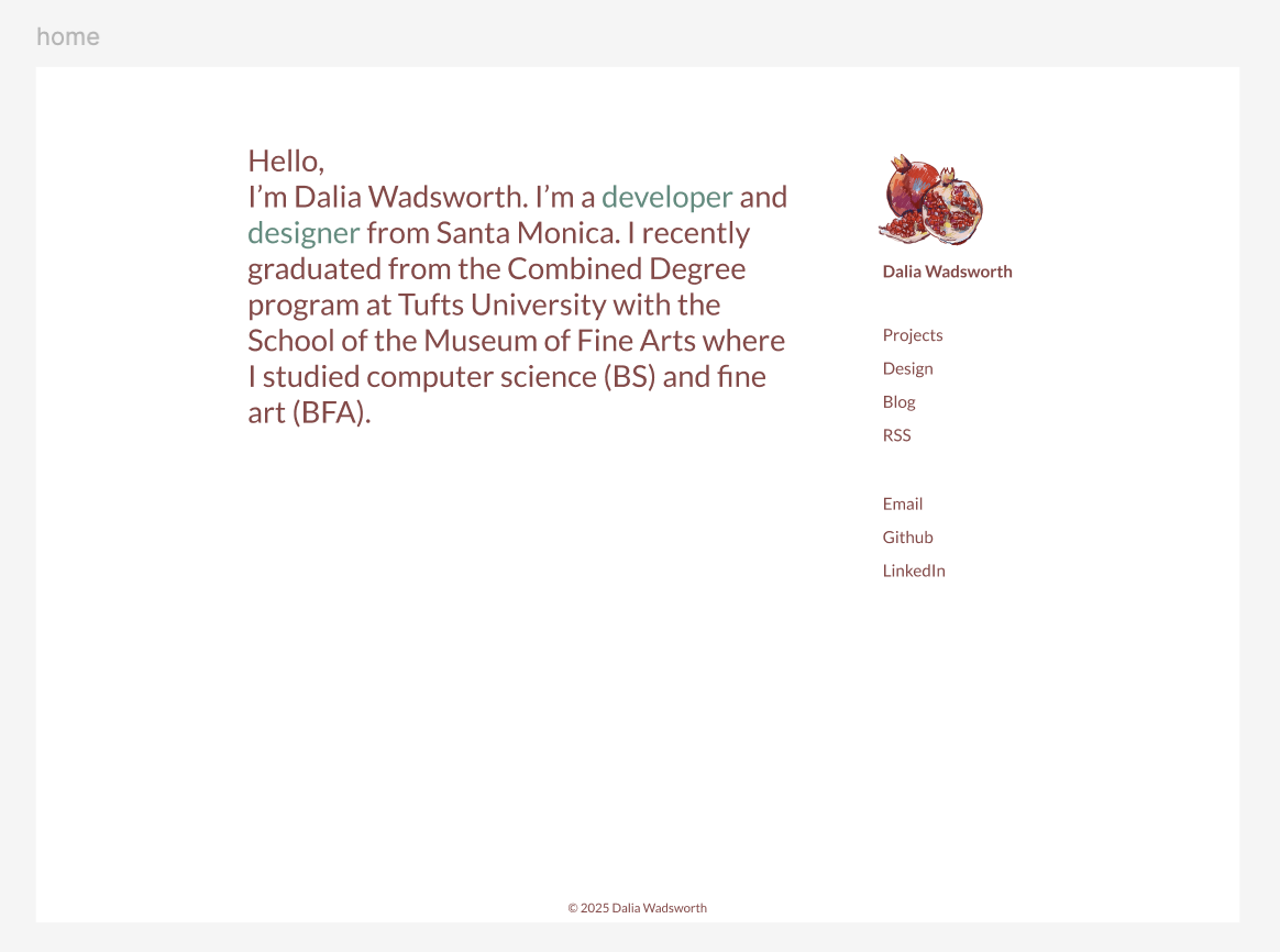
What I Kept
I liked the fonts I used (Lato and Prompt) and didn’t mind the small-screen version of the nav-bar so a version of that exists on this site. Originally, I’d planned to include more elements of the old site—as you can see in my early mock-ups in Figma:
But as I continued to brainstorm and search for more ideas, the design began to shift away from that.
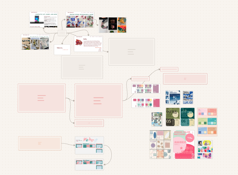
Brainstorming & Inspiration
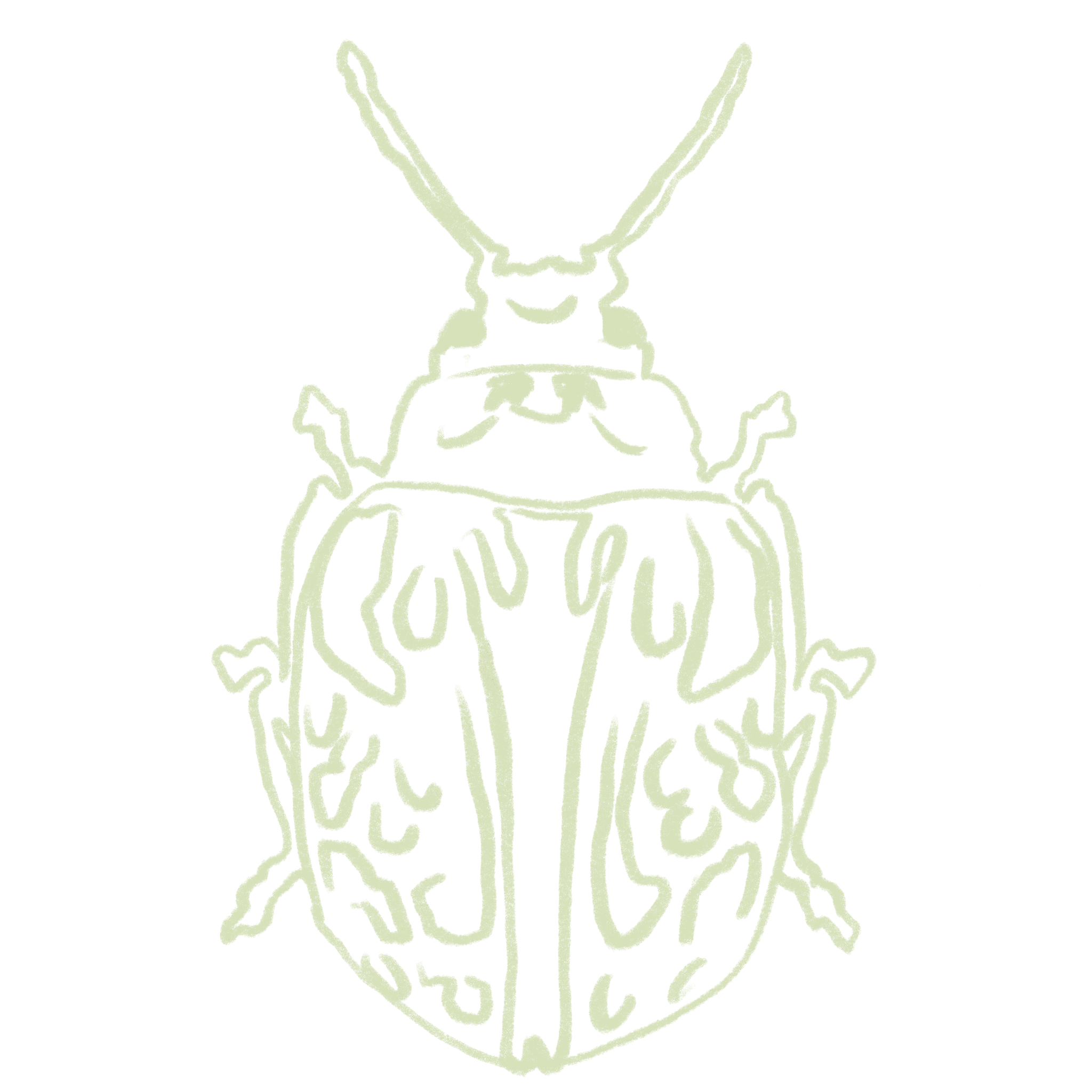
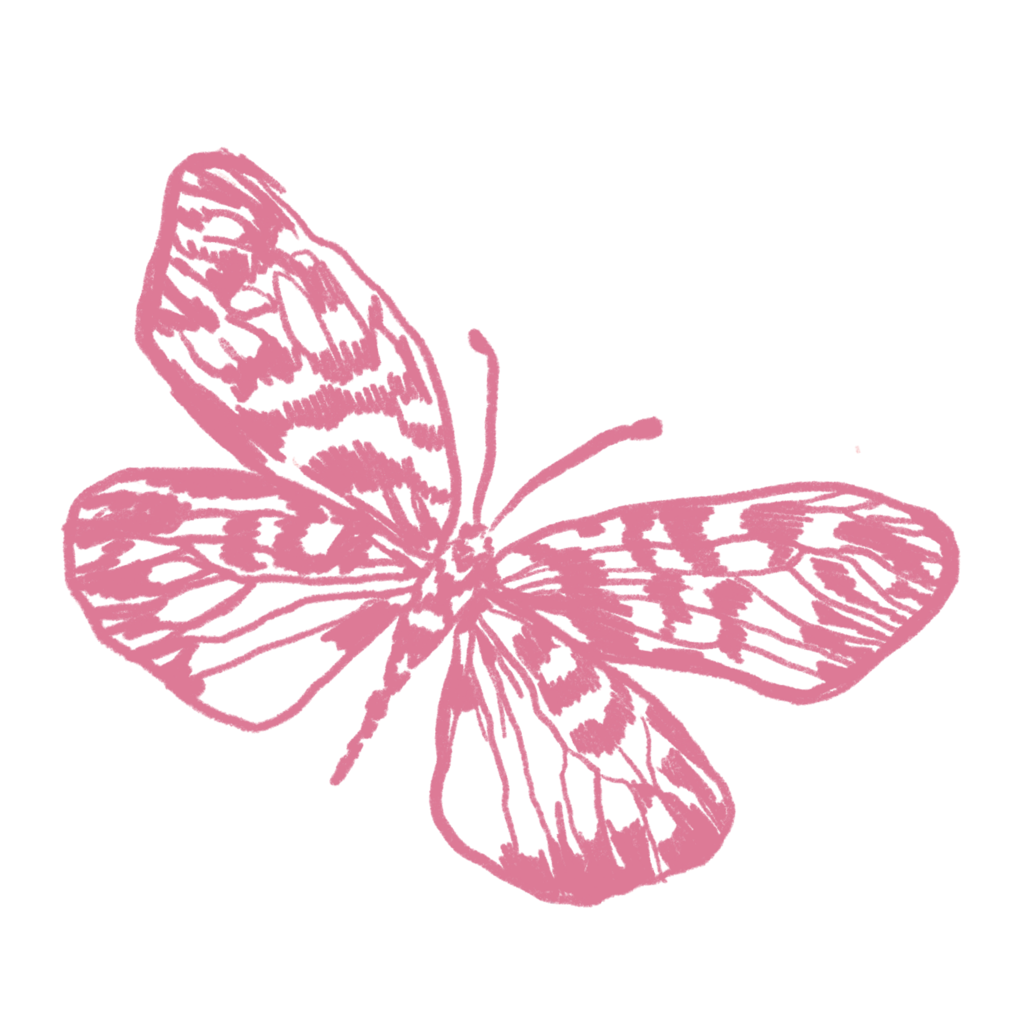
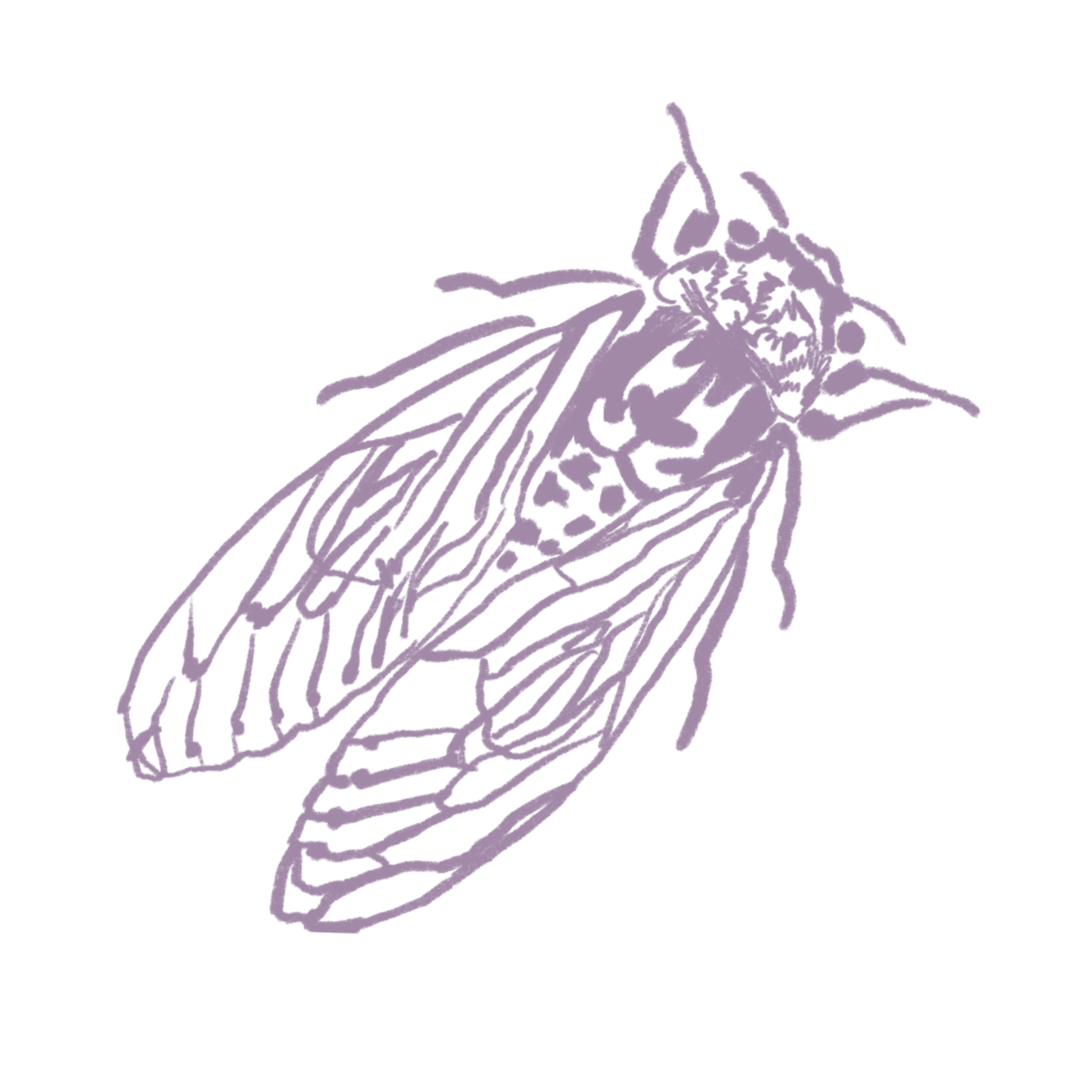
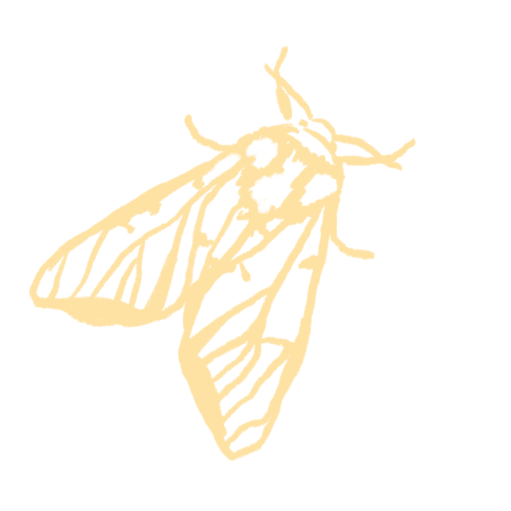
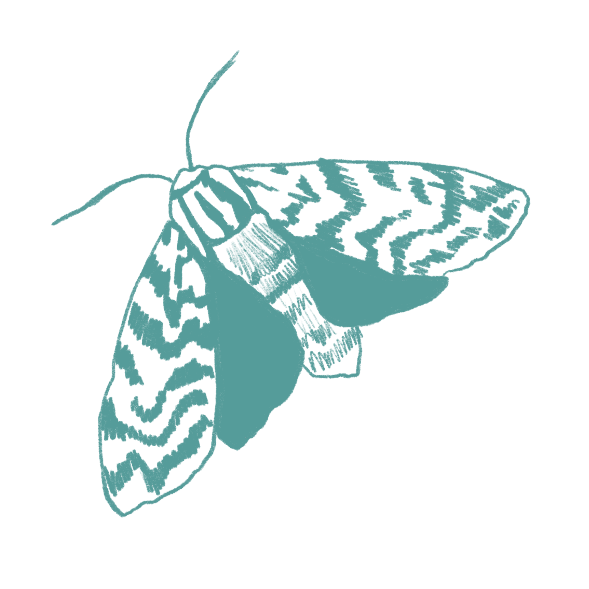
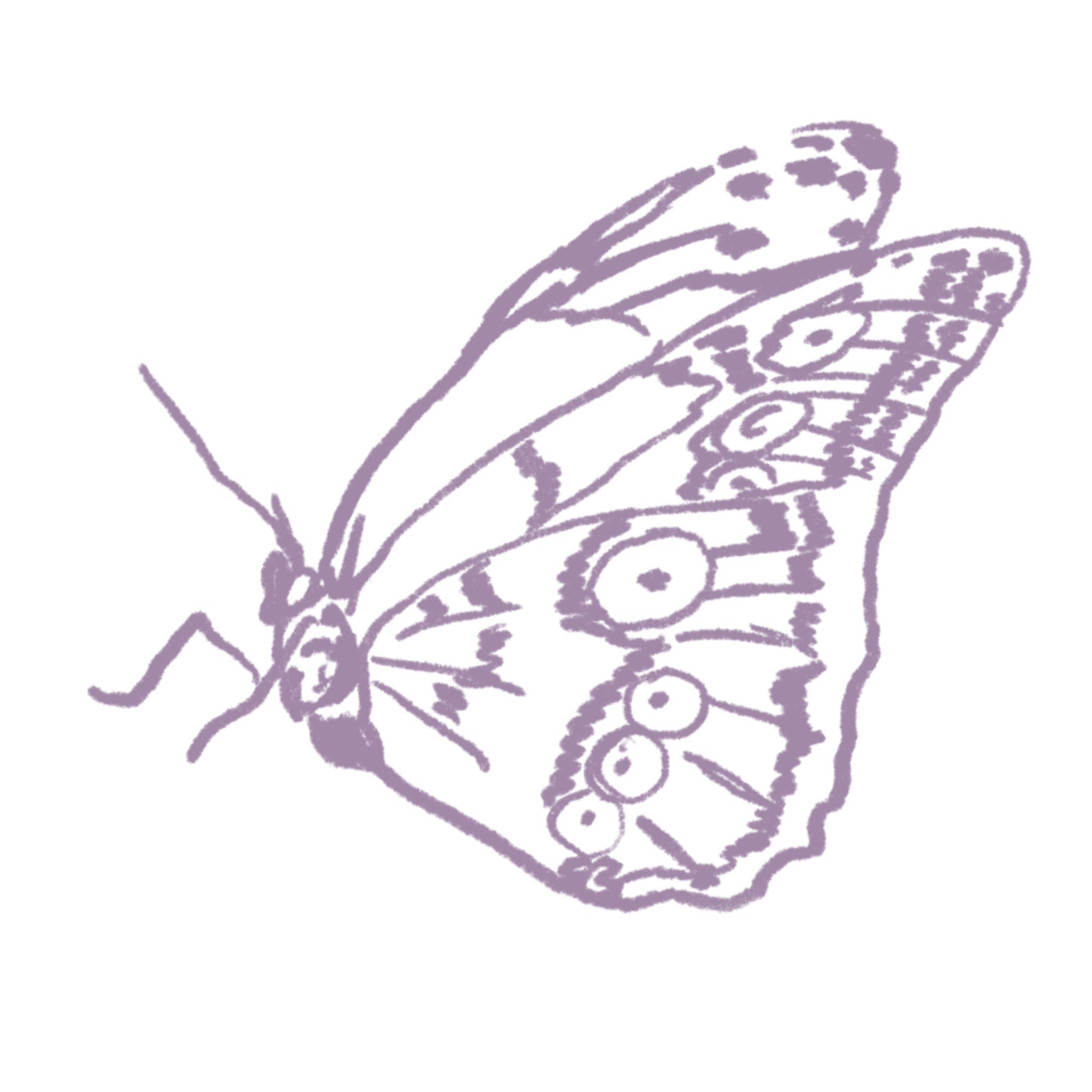
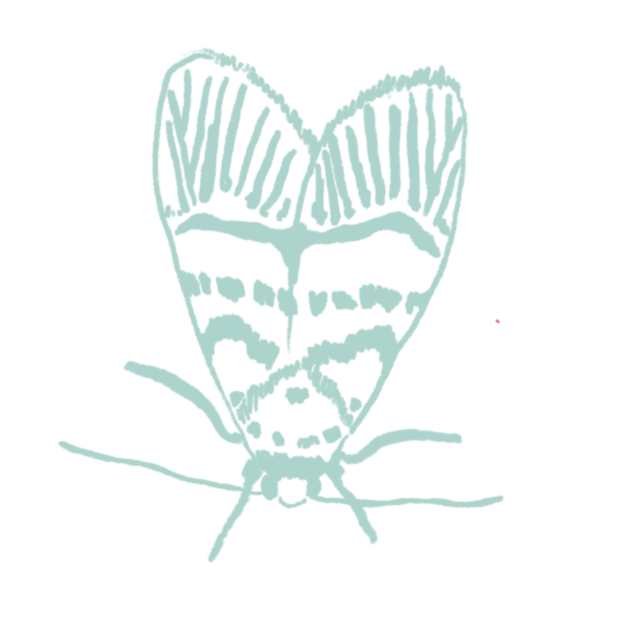
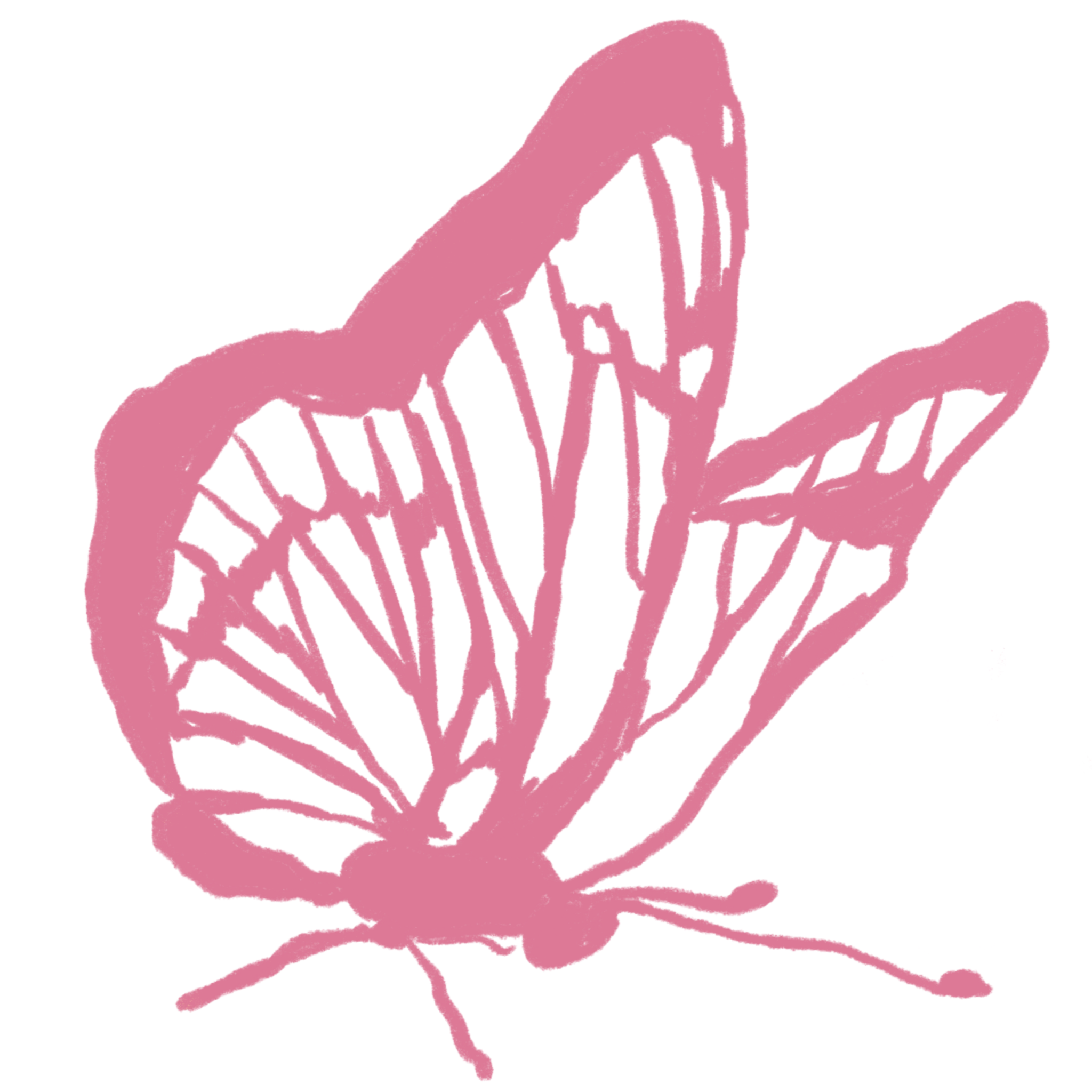
During college, I became pretty hyperfixated on bugs (I’ll write a post on that later) and started incorporating imagery of them within my art practice. I made screen-prints, zines, books, risograph prints, posters, collages, and more all about bugs (you can probably find some in my portfolio). At this point, I had lots of drawings already on-hand and the butterfly image—that now functions as my “logo”—caught my eye. The entire design of the site came together around it.
Here’s a early snapshot of my mood-board:
Deciding on an appropriate tech-stack was a little more tricky. I wanted a framework that functioned well with Tailwind-CSS, to benefit from more flexible styling, while also allowing for easy content management and publishing. That’s when I came across this blog post by Manuel Moreale, who runs a blog about blogs that I’ve been following for quite a while.
This post in particular caught my attention because it was about a student, Ben, who went to my college (though I don’t personally know him—he just happened to be in my year). Reading his interview and viewing his site—which was similar to what I had in mind—made it clear that using Astro would be the ideal solution. The framework had already come up in several interviews published before his; this was simply the final nudge I needed to get started.
Implementation
The build and design process took a few months. Since I had never worked with Astro before, getting used to its workflow took some time. I was relatively comfortable with Tailwind, but customizing components to achieve the style I wanted proved challenging. As expected, in the beginning I spent much of my time scouring references and tutorials.
Structuring the site itself was fairly straightforward. I actually enjoyed setting up the blog, planning the layout, and creating reusable components—though I have to admit, keeping custom utilities and components simple was tougher than I expected.
Final Thoughts
By the end, the site finally felt like it represented me—both in style and functionality. I had fun figuring things out along the way, and getting to design every element was especially rewarding. I know I’ll probably keep fiddling and experimenting with it in the future, but for now, I’m happy with the way it turned out. It’s the type of website that looks professional enough while still making my inner-child proud.
Thanks for reading! ☺️