Dalia
Wadsworth
I design digital experiences that are thoughtful, intentional, and functional. With degrees in computer science and fine arts from Tufts University, I work across the full arc of a project, from research and wireframes to a built, shipped product.
Currently based in Santa Monica.
Selected Work
01 / 04
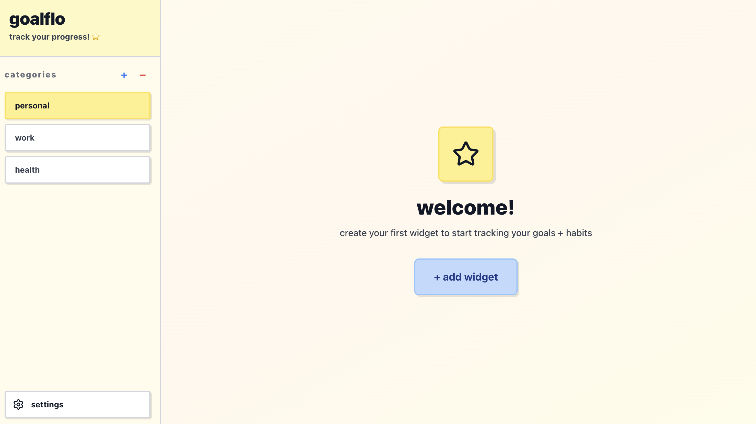
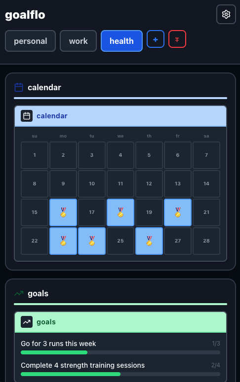
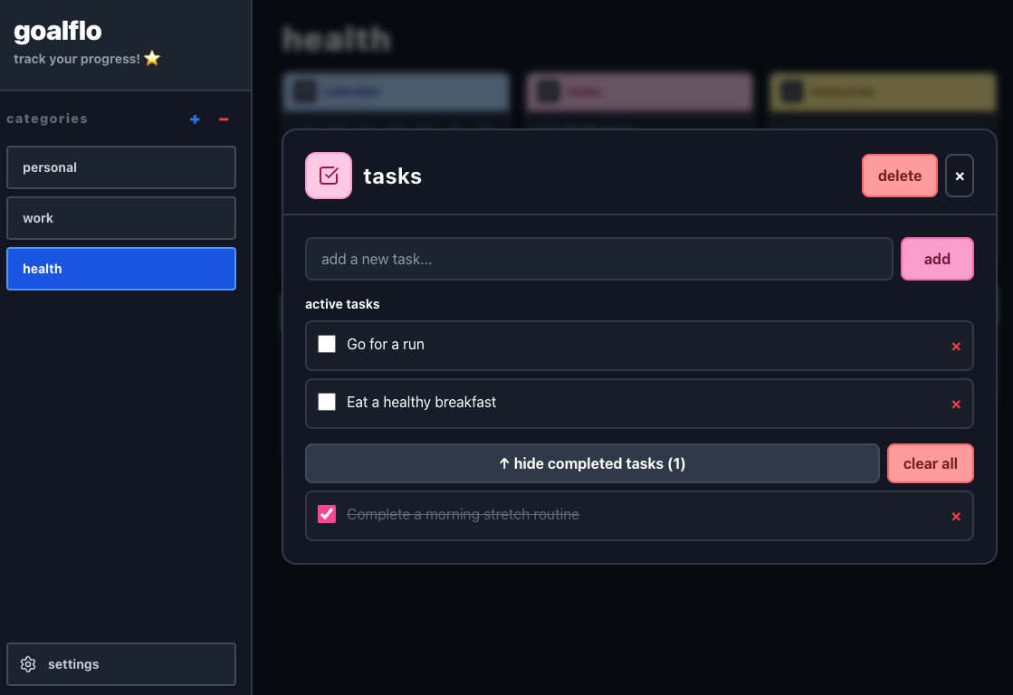
goalflo Design & Development
Designed and built a responsive habit-tracking web application that centralizes goal setting, daily progress tracking, journaling, and task management in a customizable widget-based interface
https://goalflo.vercel.app/Overview
"goalflo" is a habit-tracking and productivity web app built to bring goal setting, daily tracking, journaling, and task management into one clean, customizable dashboard. I designed and developed the entire experience—from the UI and design system to the frontend build and deployment. It’s built with React and Vite, styled with TailwindCSS, and deployed on Vercel. The focus was on creating a simple, flexible, and organized space that works smoothly across devices and makes staying consistent easier, especially for those with a variety of goals and interests.
The Problem
There are a lot of productivity tools out there. But most of them make you choose between having something powerful and flexible or something simple and easy. Some are endlessly customizable, but the setup cost is high enough that most people never build something that actually works for them. Simpler apps are quick enough to start but too rigid to feel personal, and too minimal to stay visually engaging.
The Opportunity
Most habit and productivity apps are designed mobile-first, which makes sense for quick check-ins but isn't great for the kind of bigger-picture review I wanted to do at my desk. I wanted something desktop-first that could also work on mobile — not the other way around. I also wanted category-based organization — my fitness goals, creative projects, daily routines, and reading list all live in different mental spaces.
Who It's For
Goalflo is for anyone who has tried the popular productivity tools and bounced off them. For people who have too many goals across too many areas of life to fit into a single list and those who want a tool that feels visually personal rather than generic. With low cognitive overhead without sacrificing flexibility. I also had in mind users with ADHD, for whom visual clarity and reduced setup friction can make the difference between a tool they use and one they abandon.
Design Principles
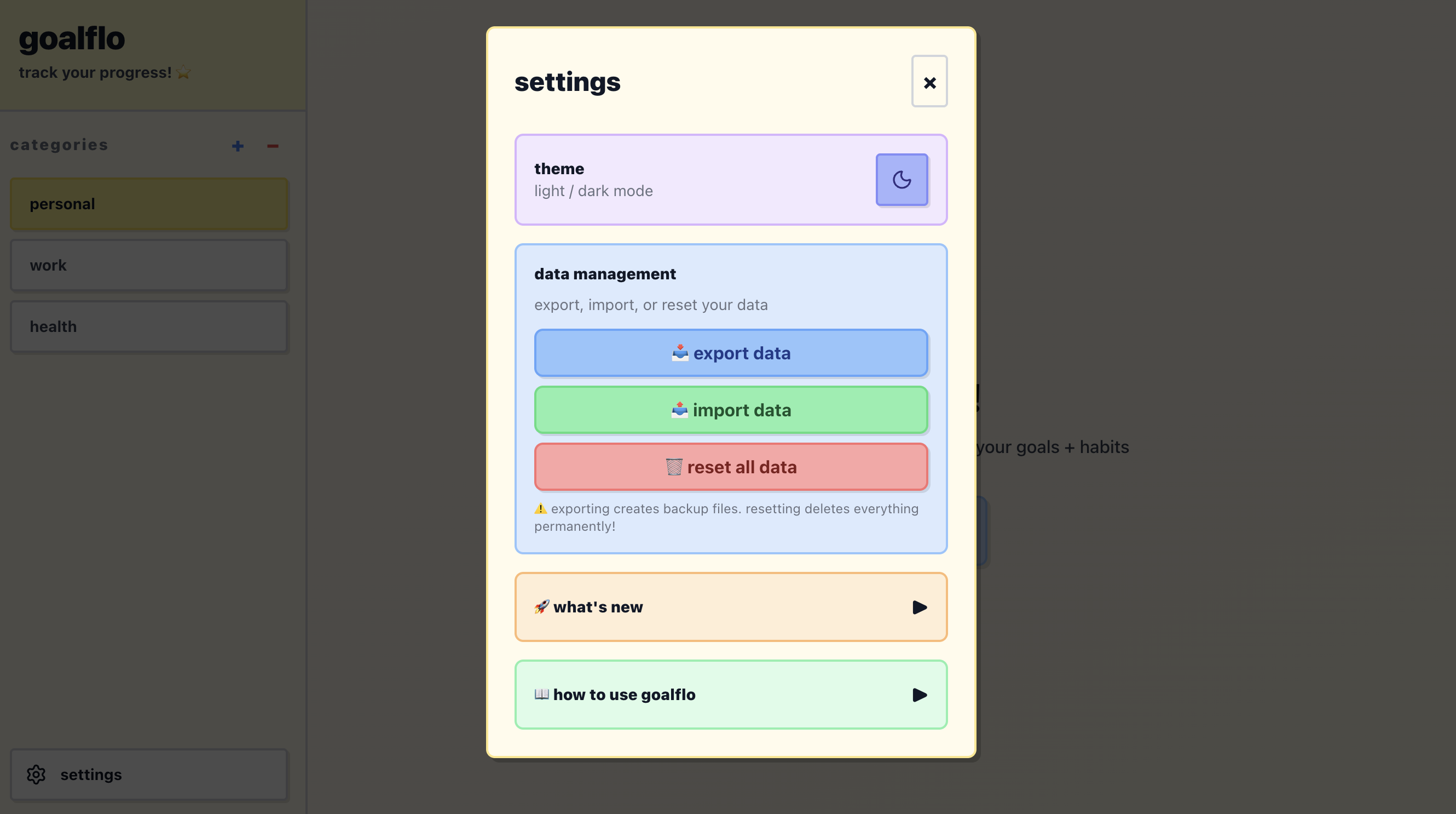
Customizable but not complicated
Every element of the dashboard can be configured, but nothing requires a tutorial to set up. The customization should feel intuitive on first use.
Visually personal
The app should feel like it belongs to the person using it. Theme options, widget choices, and category organization all contribute to that sense of ownership.
Category-first, not task-first
Rather than one flat list, everything lives inside a category. That mirrors how most people actually think about their lives and makes the dashboard easier to navigate at a glance.
Desktop-first versatility
Built primarily for desktop use — for deeper review and planning — with a fully responsive mobile version for on-the-go access.
Key Decisions
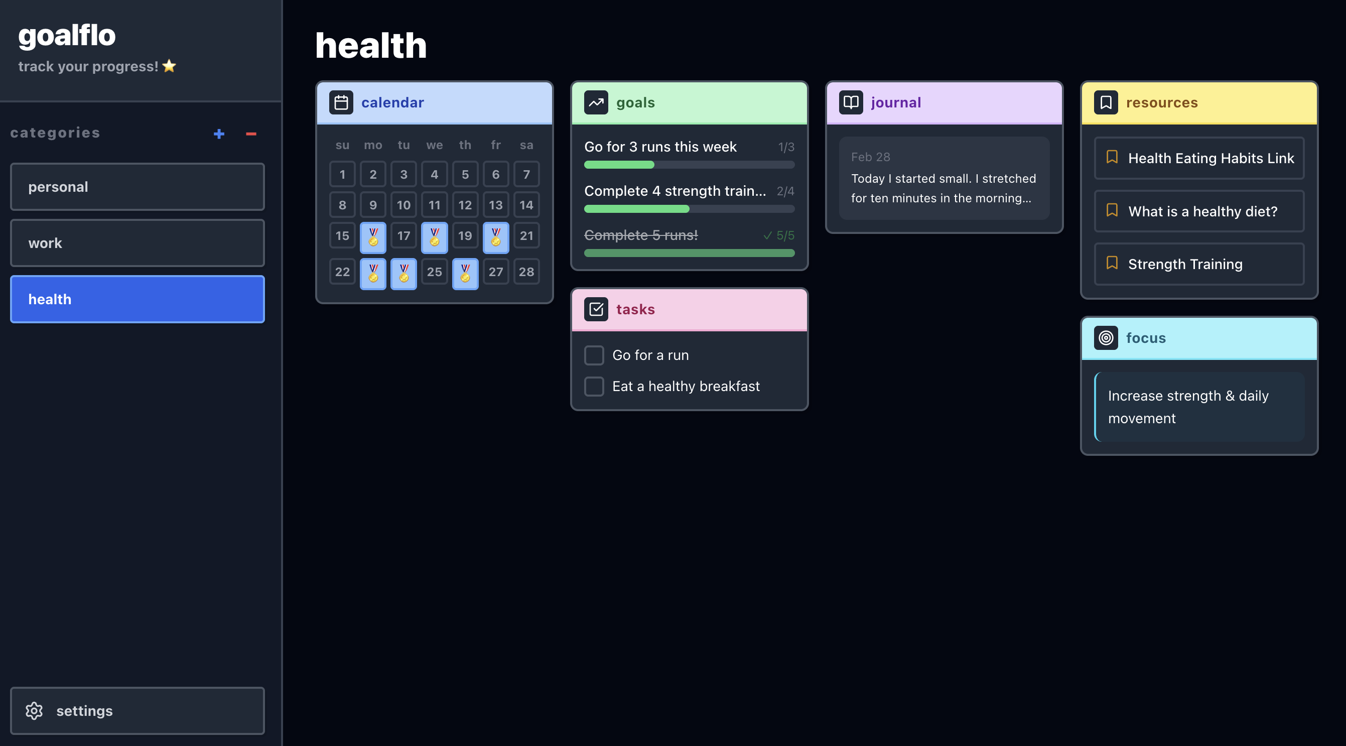
Widget-based layout
Rather than a fixed interface, each category dashboard is made up of widgets — a habit tracker, a task list, a journal, a bookmarks panel, a calendar — that the user can choose and arrange. This gives flexibility without requiring the user to build from scratch.
Category dashboards
Organizing by area of life rather than by date or priority felt more aligned with how people actually think about their goals. Fitness goals and creative projects shouldn't compete for the same visual space.
Visual balance
The visual design was intentional about landing between minimal and busy. Clean enough to reduce distraction, but warm and personal enough to feel inviting.
What's Next
- —Drag and drop widget rearrangement
- —Expanded theme customization
- —Bookmark categories (to-watch, to-read, favorites, helpful tips)
- —Multi-date calendar selection
- —Timer widget
- —Mini photo album and visual progress tracker
Year
2025 - Now
Role
Designer & Developer
Tools
React, TailwindCSS, HTML, Vercel, Vite

Life In Percent Redesign
Completed a visual overhaul of a personal development and lifestyle platform, focusing on modernizing the brand identity, improving user experience, and creating a more engaging, content-driven interface.
https://lifeinpercent.com/
WorkersComp Branding & Web Design
Designed and developed a responsive workers’ compensation insurance quote platform that streamlines coverage exploration and quote requests through a clean, user-focused interface.
Personal Blog
Designed and developed a site to present my personal programming and art projects, paired with a blog highlighting my process, learnings, and other interests of mine.
https://daliasblog.com/